
Initiatives
Brand Design System
Digital Design
Role
Art Director & Designer
ImageEngine optimizes images by up to 80% on autopilot for improved SEO, lower bounce rates, better mobile experiences, and increased sales.
/ Challenge
As a growing startup, ImageEngine needed to refine its brand to better reflect its personality and evolving market position. The original color palette lacked cohesion and didn’t capture the company’s friendly, customer-first approach or its innovative technology. A thoughtful refresh was needed to align the brand’s visual identity with how they wanted to be seen—trustworthy, approachable, and simple.
/ Solution
I led the development of a new brand color system that positioned ImageEngine as both technically strong and approachable. The goal was to create a primary and secondary palette that reflected their brand values: friendly, exciting, high-performing, and easy to integrate. I started with a questionnaire for the client before the discovery call and explored emotional tones and various color palettes, grounding decisions in color theory and accessibility best practices. We then narrowed in on a set of core colors that felt bold yet welcoming. The final colors balanced bold, vibrant accents with grounded neutrals, designed to evoke trust, clarity, and excitement. The color foundation complied with the Web Content Accessibility Guidelines to ensure legibility and inclusivity. Visual mockups helped bring the system to life. I built out visual mockups to show how the new colors to help visualize the functional impact of the new brand color system.
/ The results
The new color system gave ImageEngine a clearer, more consistent visual across all touchpoints. It immediately improved how the brand looked and felt—more polished, more cohesive, and more aligned with their customer promise of simplicity and speed. The Marketing team and agency partners now had a clear guide for applying colors in a way that supported storytelling, product clarity, and usability. The refreshed palette helped signal to potential customers that ImageEngine is not only performant and reliable, but also approachable and easy to work with—matching their goals of improving perceived quality, support, and customer experience.
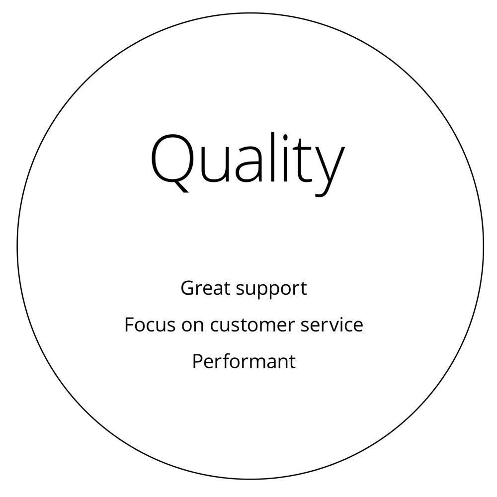
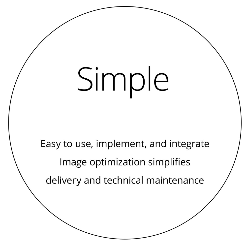
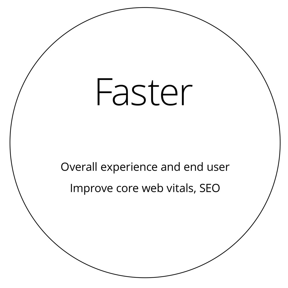
Customer perception of ImageEngine
Qualities of what customers think of the brand
Culture outlook from employees and customers of ImageEngine
Culture brand perception


The psychology of color
In my research phase, I wanted to understand the key terms or perceptions associated with each color. It was helpful in narrowing down which color best suited the brand’s personality.

Selected color themes
I selected the color themes below that aligned best with the customer and employee perception of the brand. This initial step started to shape the brand’s personality with color in mind.